The hard truth: People are spending less and less time inside GitBook itself. Content increasingly flows in from Claude, Cursor, and GitBook's own agents. When that's true, the moments people do come back into the product become increasingly important and the biggest of those moments is reviewing changes. If an agent has drafted your docs, reviewing that work needs to be fast, trustworthy and straightforward.
Change requests are GitBook's version of a branch, a safe way to edit documentation without touching what's live. And they're used a lot. Roughly 280,000 change requests are opened every month by over 33,000 users and around 84% of them end in a merge, updating live documentation sites.

Before: change requests viewable only from buried within a space
Despite all that volume, they lived buried inside individual spaces (the home for your content in GitBook). If you wanted to know what was waiting on your review across your whole organisation, there was nowhere to look. That worked well enough when every change request was opened by a human who knew where they'd left it. Then the GitBook Agent arrived.
Behind the scenes we were testing a proactive agent on our own docs, a system that scans your content and drafts fixes as change requests all by itself. Agents were entering the review loop, and it was clear which way the volume was heading.
There was no way to see change requests across an organisation, so knowing what was waiting on your review meant checking every space one by one, and remembering which spaces to check in the first place.
Imagine also that you manage multiple spaces, across multiple sites and the problem increases exponentially.

So I started at the source, jumping on calls with our users to find out their pains and workflows to try and understand the core problems. Then jumped into some concept work to explore possible layouts of how a home for change requests could function.

A version of change requests in a list style

Early concept of a triage style approach to quickly click through change requests
I led the design from start to finish, digging into how the underlying revision model works, looking at how teams actually navigated to their reviews, how they would be displayed (in a full page list, in a Linear 'triage' style?) then iterating through mock ups with the engineers before everything got polished up.
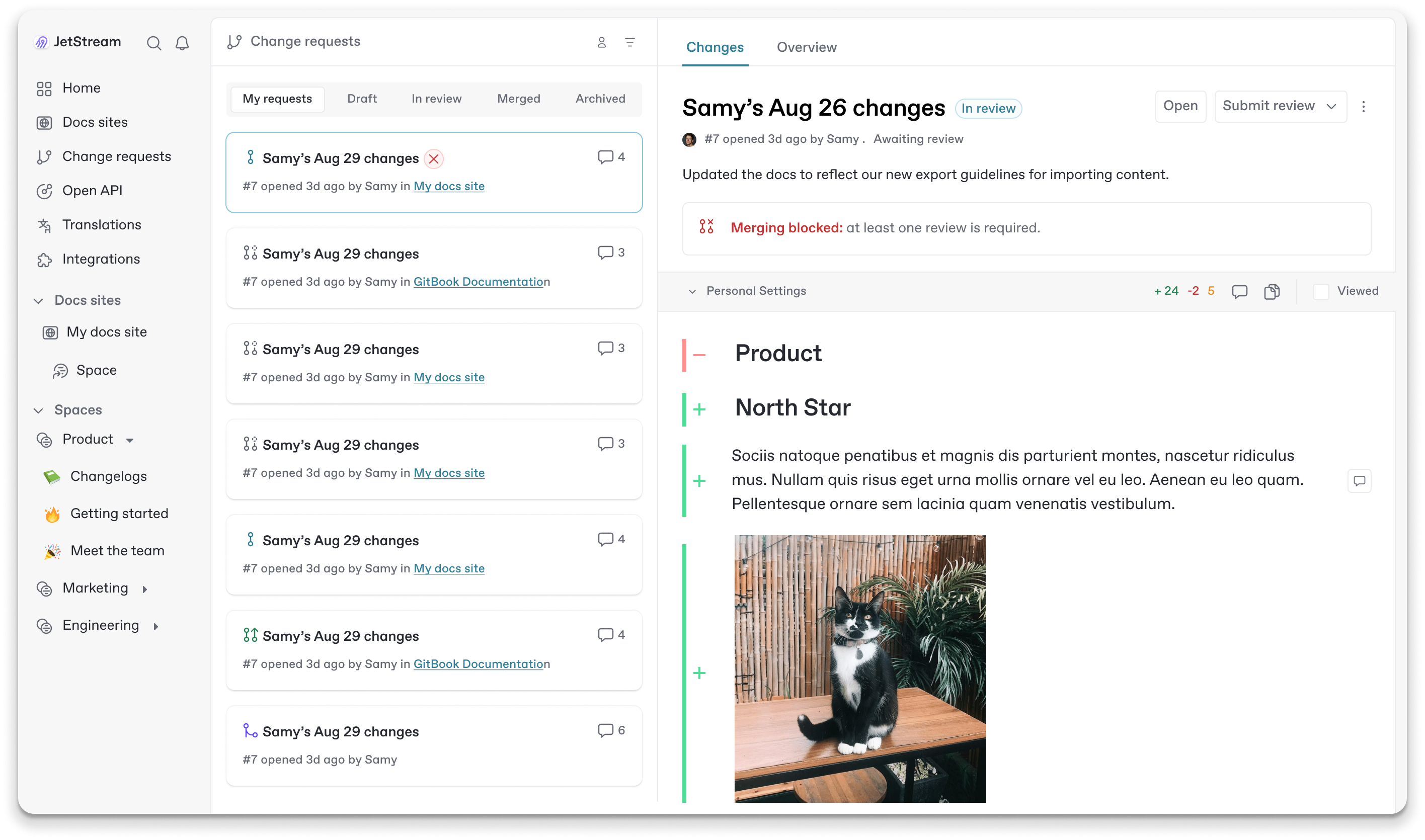
We ended up shipping the Change Request page that had a permanent home in our sidebar, laid out in a 'triage' style. The premise being that when you want to review, you want to do it quickly and reducing the number of clicks in a user's daily workflow was a priority.

After: The new change requests page as it is today (Aug 2026)
We also added a 'merge block' instead of simply using a Merge call to action as the primary button in the top right corner (a familar pattern in GitBook). This way we could show the necessary actions the user needed to take front and center. With the diff of the content sitting below so the reviewer could quickly scan and see what had changed.
And people used it. The page was opened over 11,000 times in its first two weeks, has been viewed more than 150,000 times in the eight months since launch and thousands of people now use it every month.
More importantly, it works as an entry point to actual reviewing, not just a list to look at. 53% of people who visit the page go on to open a change request the same day, typically within five minutes of landing and 31% go all the way through to merging one.
The GitBook Agent, the AI collaborator that drafts and edits content inside a change request, originally lived as a sidesheet. Opening it meant collapsing part of the workspace, pushing aside the very content you and the agent were working on together. You were constantly choosing between seeing the conversation and seeing the result.

Before: the GitBook Agent triggered from a header button and opening a sidesheet
I redesigned it as a floating panel that sits over the workspace instead. The idea started life as a prototype I built with Claude, a working, clickable version of the panel rather than a static mockup. Having something the team could actually play with made all the difference.
It gave engineering something concrete to react to, helped shape the thinking on how the panel should behave over the workspace and kicked off the implementation from a shared starting point, rather than a set of screens open to interpretation.
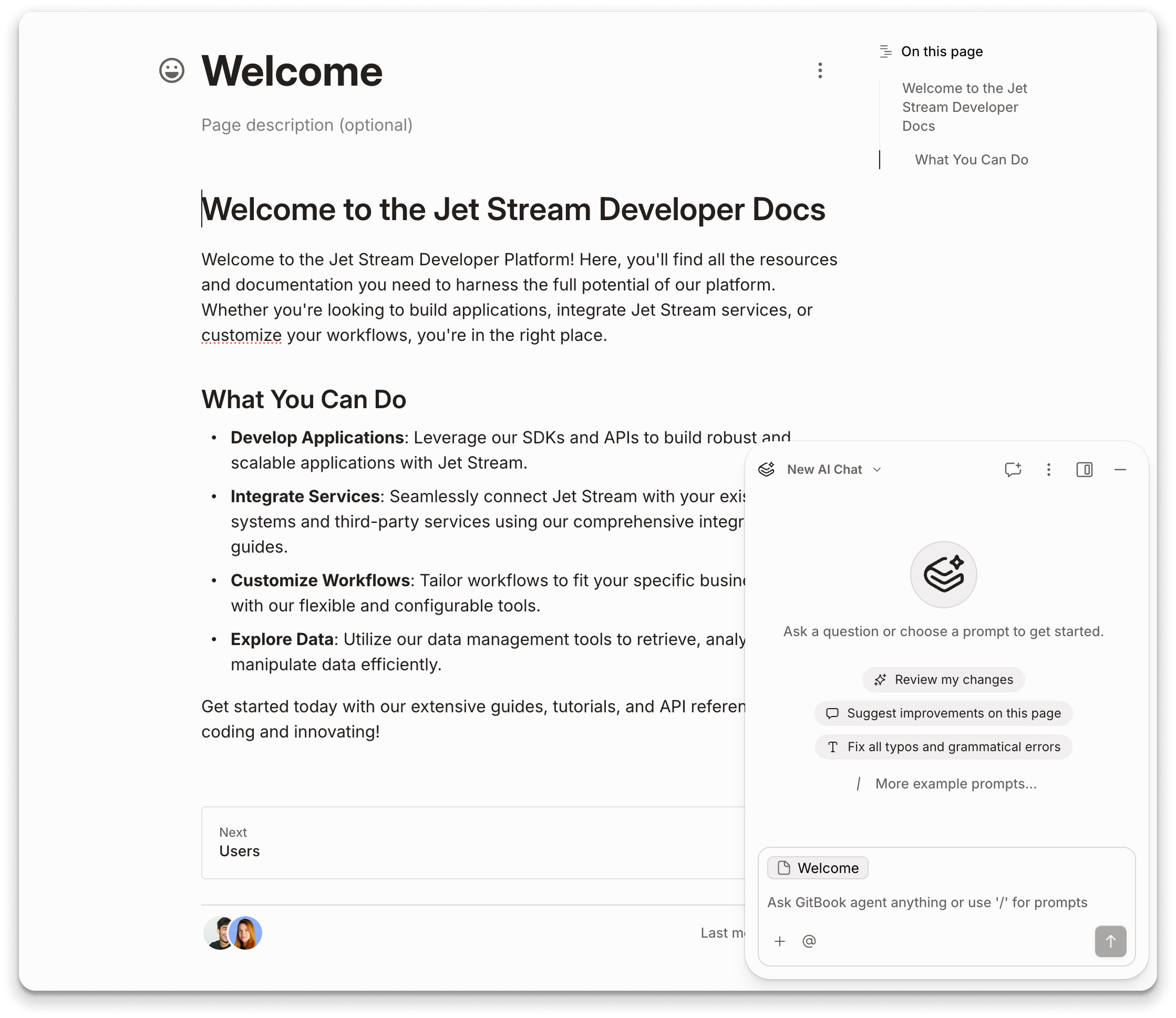
After a few iterations we landed on a floating panel on the right of the editor, with the sidesheet an option rather than the default.
Users also took to the change, in the last month (July 2026) over 17,000 people opened the agent inside a change request and sent it more than 50,000 messages. While switching away from the floating agent layout happened in fewer than 2% of sessions.

The floating agent panel in production as of Aug 2026
After the agent had been released, I wanted to experiment with the style and personality of the floating panel. Fable 5 had just been released so I was tasked in attempting to bring more attention to the agent.
I experimented with automatic prompting, a user adds a block and the agent (only once) shows the user what a possible interaction they could use i.e 'generate an image for these cards' as well as a new design for the agent and a floating 'orb' with a pixel effect over a standard button.
Unfortunatley this still remains a work in progress as I left the company while exploring the concept, but it was very fun to create nonetheless.